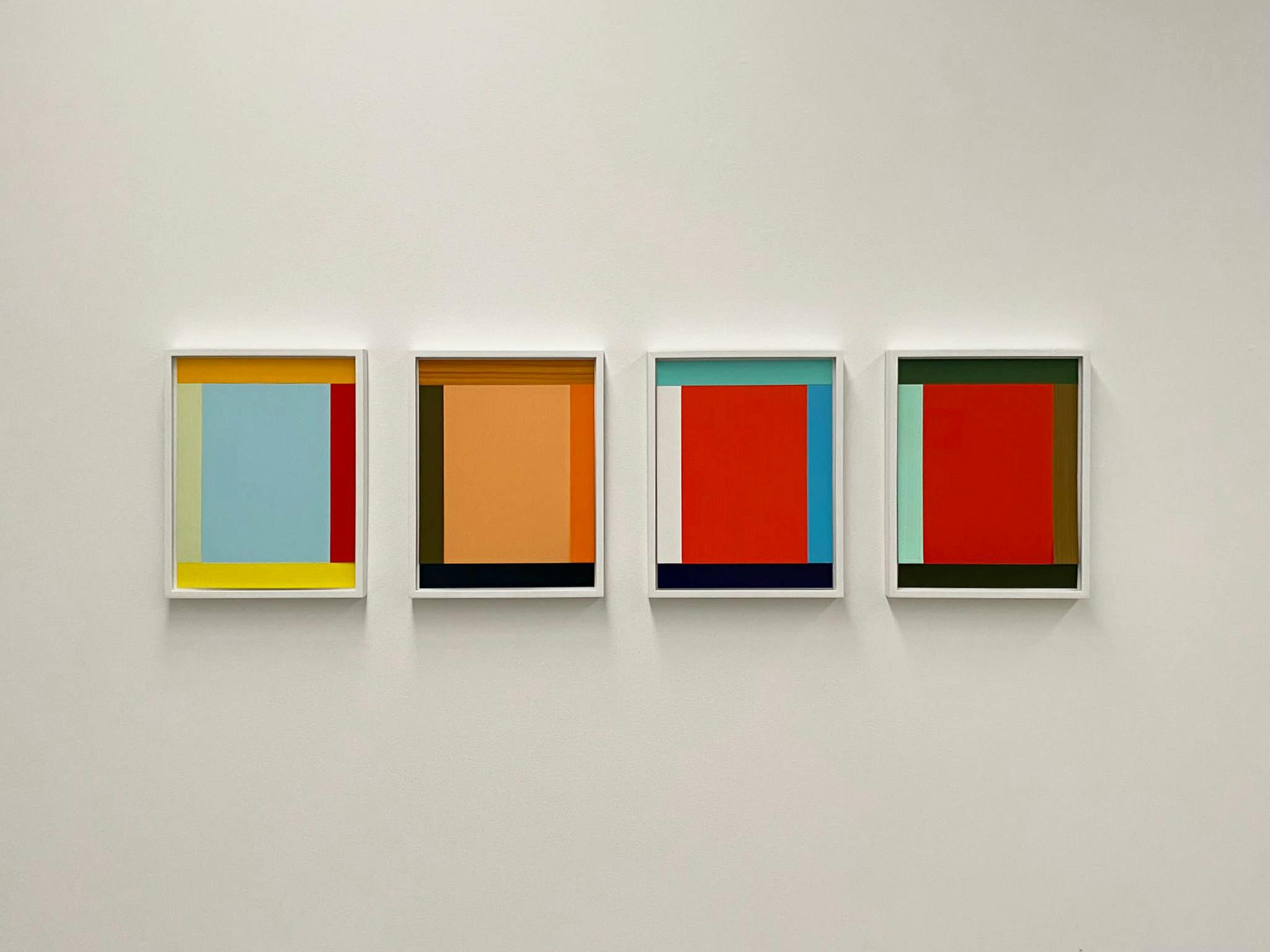
Imi Knoebel, Anima Mundi 51-2 Ed. 2010 / 2016 hand-coloured acrylic on paper – 2 parts 46 x 36 cm each panel edition 5 + 2 ap + 1
Photo Credit

Imi Knoebel, Anima Mundi 51-2 Ed. 2010 / 2016 hand-coloured acrylic on paper – 2 parts 46 x 36 cm each panel edition 5 + 2 ap + 1
Photo Credit
Over the years we have made various projects that have taken the exploration of colour as the compelling thread that connects the works… Most notably the various iterations of The Architecture of Colour (2012), (2013) Farben (2003), (2013), and Chromofection (2016). This latest celebration of colour is simply called Hello. Hello because we are reacquainting ourselves after %#€?ing lockdown, Hello because these works come out to greet you with their terrific blend of chromatic seduction and their insistent form.
Imi Knoebel is without question one of the great colourists of our time. In 2011 he was commissioned to make a set of stained-glass windows for Chartres Cathedral’s Saint Joseph and Sacré Coeur chapels. The first were a reparation gift from Germany to France and in 2015, Knoebel himself donated a further three windows to the Jeanne d’Arc chapel.
In Chartres, colour and light are given full opportunity to collude much in the same way that Matisse and Le Corbusier collaborated on the Rosary Chapel in Vence, Provence between 1947 and 1951.
Knoebel’s emblematic Anima Mundi works are collages that hark back to his early abstract Grace Kelly portrait paintings. Repeated rectangular forms sit at the margins of each portrait form, though the colour and the brushstrokes differ from one to the next. Knoebel’s use of iridescent pigments means that not only is the geometry of the form quietly “adjusting” but the depth of the painting shifts in relation to lights play on the pigment.
Nikolic has quietly set about overturning chromatic norms. His paintings fuse seemingly impossible connections between colours that ought not to synthesize but they do. Not only are his paintings built upon collisions of colour and structure, but they have a deeper connection to historical painting, works that have moved him to respond. Pay the prophets is a full expression of his engagement with the esoteric colour theory the Seven Rays, and a respectful nod to Sassetta’s The Burning of Jan Hus, a Predella panel in the collection of the National Gallery of Victoria. The jazzy chromatic arpeggio takes your eye back and forth across its full length.
For a brief time, Jan Albers was a frustrated painter, cramped by the requirements of painting for a neatly folded linen corner. On leaving the Dusseldorf Kunstakadémie, Albers also left more orthodox painting behind to occupy the space between the 2nd and 3rd dimensions. Albers relief works retain just enough sense of the picture plane, but they have sculptural form and thickness that means that colour, especially in these cast resin works, is animated by the way that light passes through the forms rather than way it plays upon it.
Bill Culbert, somewhat like Albers’, began his time as a painter but morphed into a sculptor, albeit one who like Dan Flavin and François Morellet would co-opt fluorescent light to transport colour and transform space. Much of Culbert’s work expressed an intersection between the tangible and the invisible. Familiar objects are punctured by light sources – a suitcase, a formica dining table, a chair – even low brow plastic bottles. The latter are transformed by the seemingly effortless marriage of PVC and a fluorescent tube into domestic versions of Knoebel’s Chartres Cathedral windows.
Hello is a happy, celebratory exhibition. It could easily have been called Anima Mundi but that title was already in play.